In progress
Plotted
An editorial data-visualization gallery where each piece is a self-standing visual story built on publicly available datasets. D3 interactivity meets authored visual language.
2
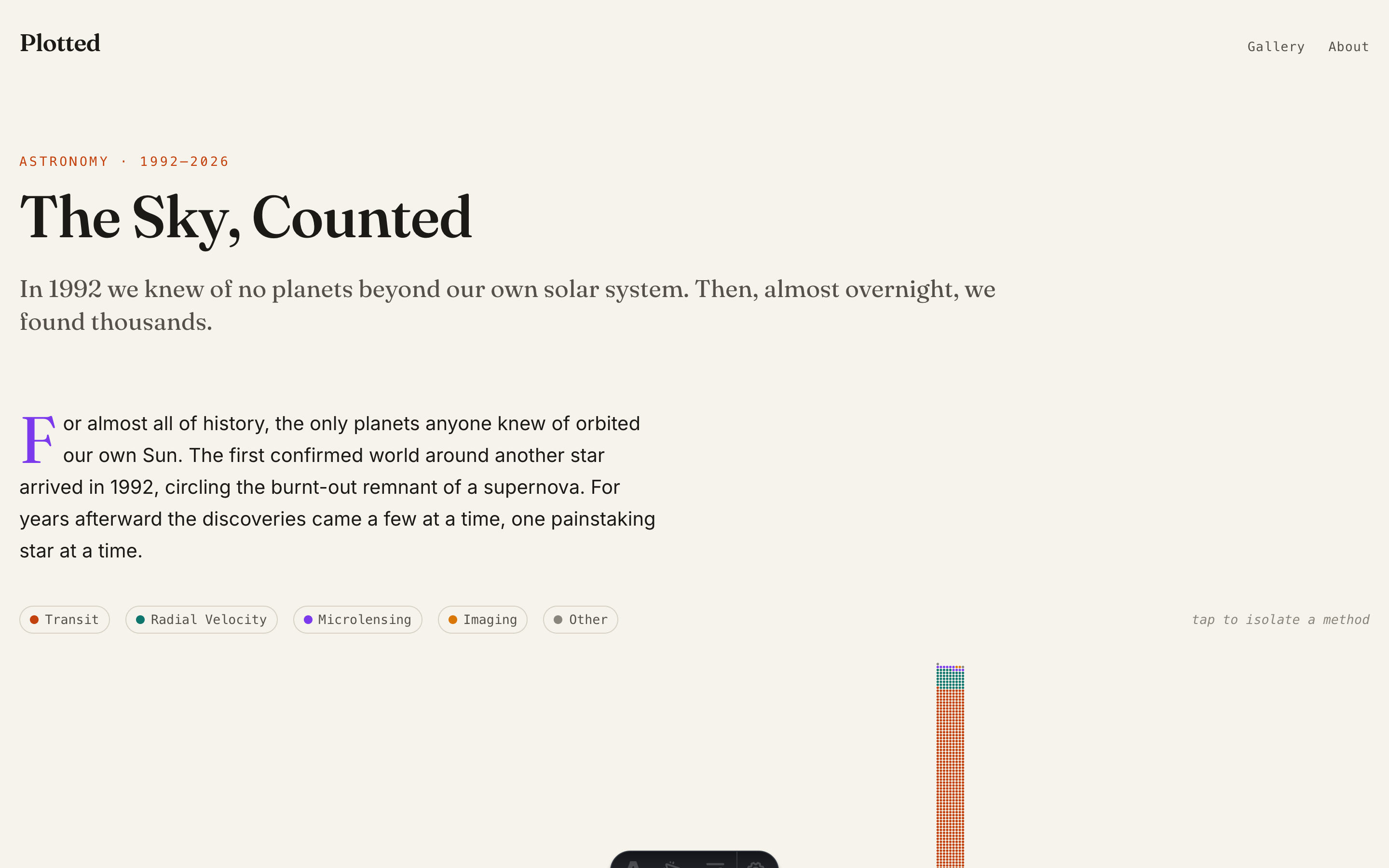
Completed pieces, gallery deploy in flight (life expectancy, exoplanets)
D3 + Astro
Interactive SVG on a static site; no server needed
Public data
Every piece cites its source and license
Intent
Can a chart be worth reading?
Most data dashboards optimize for density and utility. Plotted asks a different question: can a visualization be a story worth reading on its own, with real interactivity, honest sourcing, and a visual language that earns attention?
Process
Bespoke D3 from public datasets
Each piece starts from a publicly available dataset (OWID, NASA, BLS) and gets a bespoke D3 component with its own layout, palette, and narrative arc. The gallery runs on Astro as a static site with a warm editorial design system.
The work
Data pieces as authored stories
- → A visual language that treats data pieces as authored stories, not dashboards.
- → Interactive D3 visualizations running as pure static HTML.
- → A gallery format designed to grow one piece at a time.